Swipe!
The idea of this project is to find if there is a tendency between unconscious swiping direction and speed in UX and the user's preference. Tinder demonstrated a very successful example of associating user preference and UX. Tinder train users to swipe left if they do not like the match, and right if they like. Also, some research claims that eye gaze direction is related to inhabited behavior or subconscious desires. (The Whites of Your Eyes Convey Subconscious Truths)
To learn user preference more precisely, Swipe! shows the user some series of random images. Given straightforward direction, 'Swipe LEFT if you do NOT like the image, Swipe RIGHT if you DO like the image,' Users freely swipe the images, Swipe record the angle, speed of swiping, and analyze them at the end.
What Swipe! collected are
0. the order of the image
1. throwing in/out
(User cannot swipe the card till you drag the image more than certain pixels, and it would be recorded as throw-in if the distance is not far enough. Swipe! analyzed that as a sign of hesitation.)
2. the image URL
3. swipe direction
4. time consumed during swiping (also related to hesitation)
It shows results like below. (SpreadSheet link)
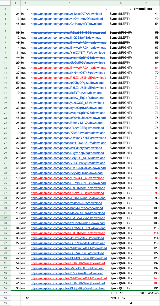
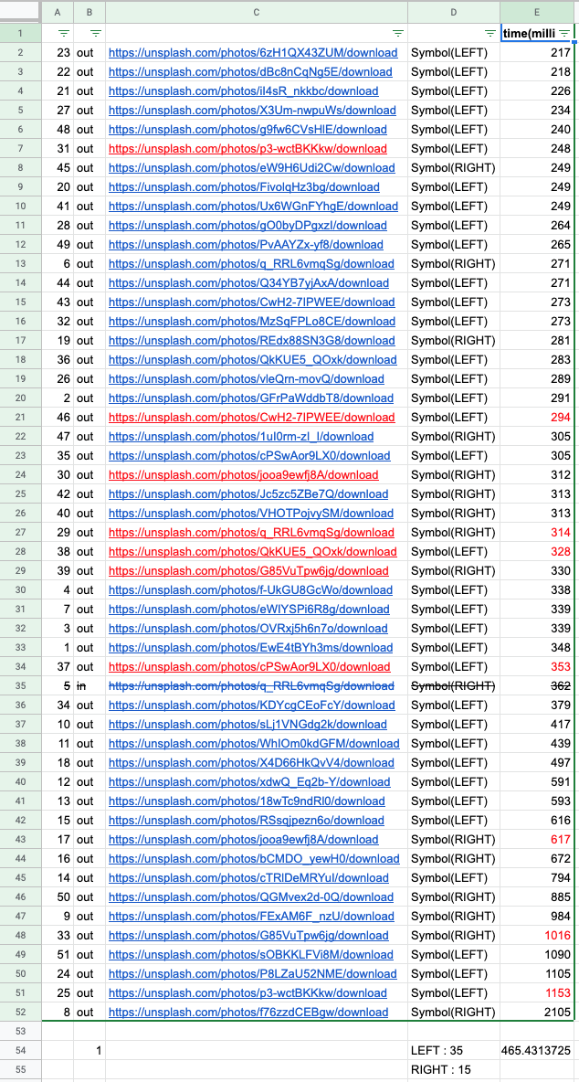
Analysis between two user tests (Y and P)
0. Y hesitated five times more than P.
1. Y decided much faster than P.
(90.65 millisecond: 465.43 milliseconds per image) It shows different familiarity.
2. P has a much clear preference towards images. Y liked 34 images out of 55, whereas P only liked 15 images out of 55.
3. Y hesitated for the images that she does not like (3 times), P hesitated for the image he likes. (just once)
4. Y hesitated when she makes a quick decision. All of 5 in's were made within 64 milliseconds. (average 90.65 milliseconds)
In the case of P, his hesitation was made relatively slower than Y. (365 milliseconds, average 465.43 milliseconds)
5. P made quicker decisions for the images that he does not like. 9 out of 10 quickest decisions were for left direction, whereas Y's quickest 10 decisions were divided by just half.
6. Y intentionally made some images poped again to see how the users react when they see the images they have already decided.
In her case, she has never changed the decision about the image, and for most of the time, she took slightly more milliseconds when she saw the images again.
That means Y hesitate like 10 milliseconds if she sees the same images again, but she did not change her decision. (the time difference is almost ignorable.)
In the case of P, even though he did not change his decisions, but it took a much shorter time when he makes decisions again. In some of the cases, he spent only the third of milliseconds to make the same decision again. This might means that showing the same dates again in date apps is not meaningful.
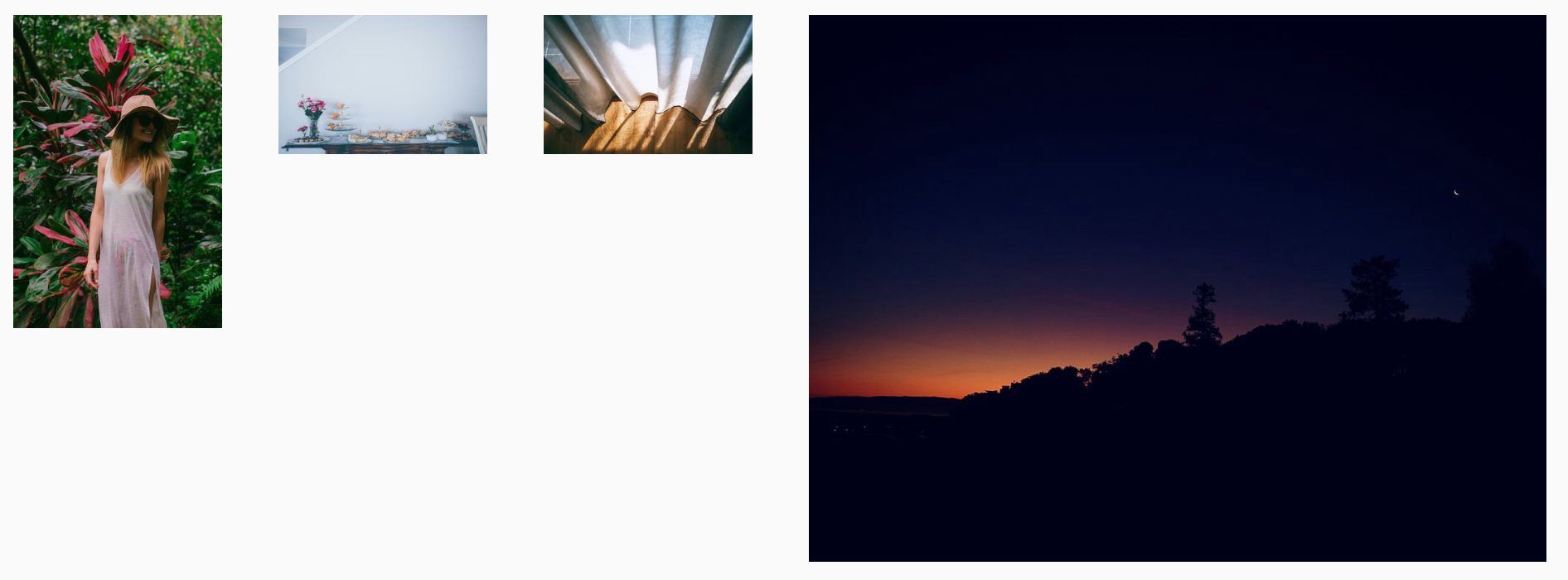
7. Swipe! made a spectrum of Y's image preference by aligning them with the time and direction. The images below are 'fastest left'-'slowest left'-slowest right'-'fastest right' images.
The most left and rightest images are different and showing Y's preferred image style, but the images between is pretty vague and even looks similar to each other.
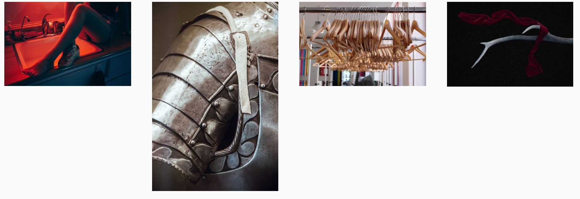
Here is P's image preference spectrum.
Here is P's image preference spectrum.
For further steps, Swipe! can make a preference learning system. Tracing the user's most and least favored image styles and it can be used to get rid of vague images or for some curation.
System
Javascript, HTML, CSS, PythonRole
Concept, ProgrammingCredit
Swipe! referenced Swing by gajus for the javascript UI.
New York, Spring 2018